- 한국어
- English
- 日本語
- 中文
- العربية
- Español
- Français
- Deutsch
- Pусский
- Tiếng Việt
- Indonesian
By Honorary Reporter Volga Serin Suleymanoglu from Turkiye (Turkey)
Season two of the hit Netflix series "Squid Game" features a striking new logo highlighting the pink guards.
The logo's designer is Avalynn Hayoung Kim, 25, a motion graphic designer who collaborated on it with Devastudios. Her journey from creating a fan-made "Squid Game" opening sequence as a college project to joining the official design team for the K-drama attests to her impressive growth in the field.
The following are excerpts from an email interview with Kim from Dec. 29 last year to Jan. 30.
Avalynn Kim in May 2023 graduated from Otis College of Art and Design. (Avalynn Kim)
Briefly introduce yourself.
I graduated from Otis College of Art and Design with a degree in digital media: motion graphics. I've always been fascinated by moving graphics on television.
How have your projects and career been?
I've been in motion design for four years. In 2023, I started working with Devastudios. I've contributed to projects like "Barbie," "Bridgerton" season three and the Wired motion logo. I've also collaborated with Netflix, Warner Brothers and Amazon Prime.
Explain how you made a fan-produced opening title sequence for "Squid Game."
One of my favorite genres is horror and thrillers, making "Squid Game" my absolute favorite show. While a student at Otis, we created for homework title sequences for a show we picked and that's when I made the title sequence. The main idea of this is social hierarchy, and I also used a visual style of a painterly rough texture to match the thriller theme and soundtrack.
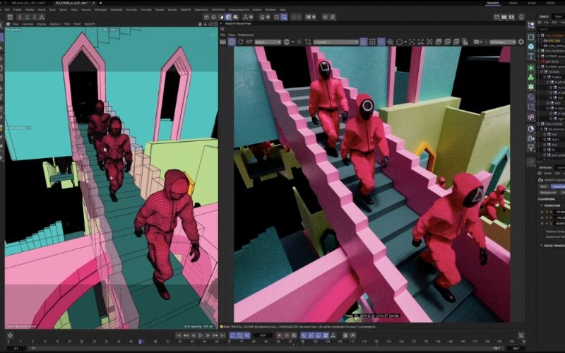
Design process of scene (Netflix)

Sample storyboard (Netflix)
How did you reflect key elements of the show in your design?
For season two, I drew inspiration from one of the key settings: the staircase. In the series, the staircase is central, where players enter and exit the game, and where the guards travel to and from their duties. I designed it to gradually merge into the Netflix logo. My goal was to make the audience feel like they were stepping into that world, creating a sense of presence right from the start of each episode.
What advice do you have for success?
Though a cliche, I'd say, "Don't give up and enjoy what you do." I feel fortunate for my experience and career, but I've always shown up and tried my best on every opportunity I get. I always do thorough research on a project I work on and on extra details. So push yourself.
msjeon22@korea.kr
*This article is written by a Korea.net Honorary Reporter. Our group of Honorary Reporters are from all around the world, and they share with Korea.net their love and passion for all things Korean.